 Skip to content


A shopfront is not simply the exterior of a business. It is a permanent advertisement, a navigation point and often the first indication customers receive of the quality they can expect inside.
People make quick decisions when walking or driving past commercial premises. If the signage is generic, poorly proportioned or difficult to read, the business can disappear into the surrounding street. A distinctive shopfront does the opposite: it attracts attention, makes the premises easier to remember and gives the brand a physical presence.
Your shopfront sets expectations
Customers form an opinion before entering the building. The materials, colours, lettering and general condition of the façade all communicate something about the business.
A carefully designed shopfront can suggest quality, heritage, creativity or exclusivity. A neglected or unsuitable sign can undermine an otherwise excellent business.
This is particularly important for pubs, restaurants, hotels, boutiques and specialist retailers, where atmosphere and customer experience are part of what is being sold. The entrance needs to feel consistent with what awaits inside.
What are prismatic 3D letters?
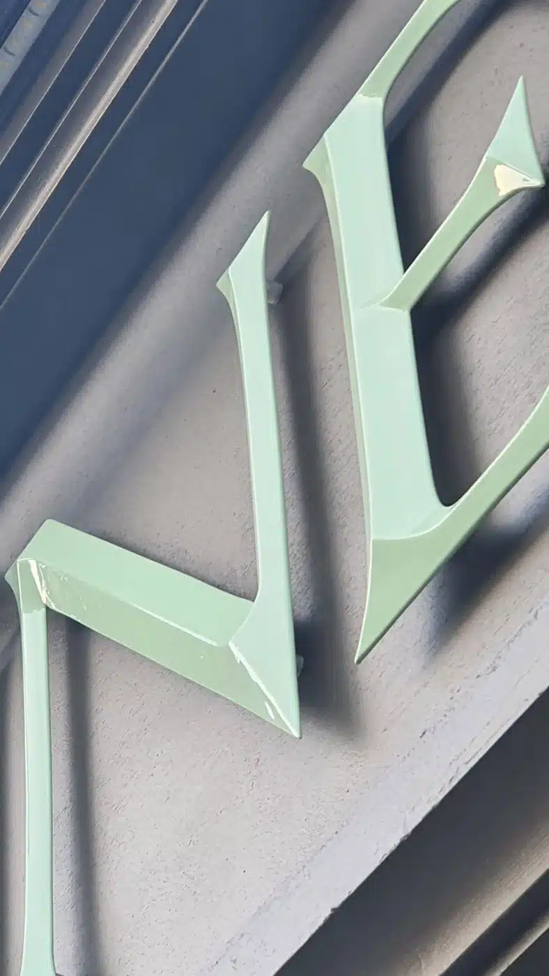
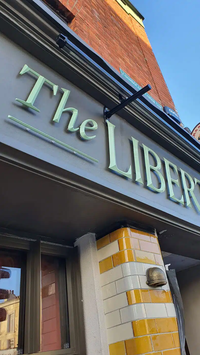
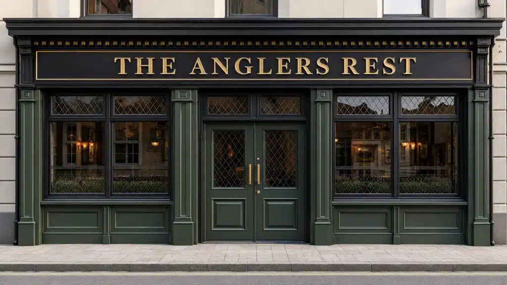
Prismatic letters have raised, faceted faces rather than conventional flat surfaces. The centre of each letter projects forward, creating angled sections that catch and reflect light differently throughout the day.
This construction gives the lettering more depth and visual interest than standard flat-cut or conventional 3D letters. The highlights and shadows change depending on the viewing angle and available light, helping the sign remain distinctive without relying on excessive size or illumination.
The effect is architectural rather than simply decorative.
Vintage character without looking dated
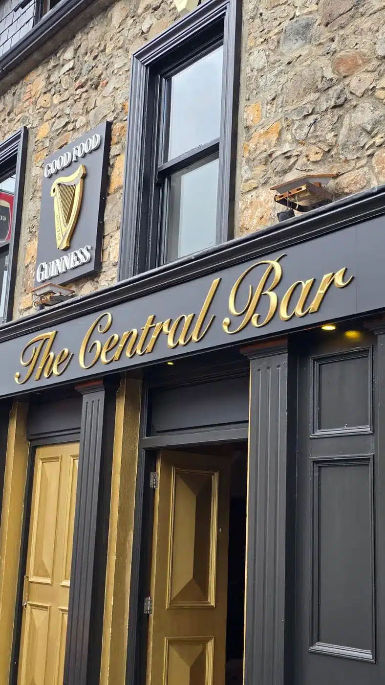
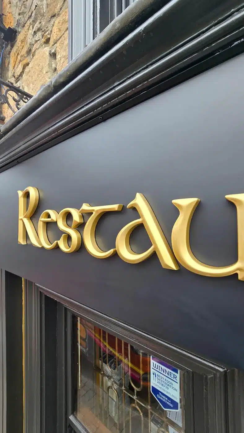
Traditional pub signs and historic commercial façades frequently used dimensional lettering, gilded details and carefully proportioned typography. Prismatic letters draw on that visual language while allowing the sign to be manufactured using modern, durable materials and finishes.
The style can create a sense of heritage even for a new business. However, vintage does not need to mean old-fashioned.
When the typography, spacing and colours are properly considered, prismatic lettering can feel both established and contemporary. A gold or bronze finish against a deep green, burgundy or black fascia can produce a traditional appearance with a distinctly premium edge.
A premium finish with genuine depth
Flat graphics can reproduce almost any colour or design, but they cannot create the same physical interaction with light. Prismatic letters produce real highlights and shadows because the depth is part of their construction.
Depending on the project, they may be produced from fabricated metal, aluminium, acrylic or precision-shaped exterior-grade materials. Finishing options can include sprayed gold, metallic paint, powder coating, specialist metal effects or genuine metal faces.
The correct specification depends on the building, installation height, viewing distance, exposure to weather and available budget.
More than lettering alone
The best results come when the letters are designed as part of the complete frontage rather than added as an afterthought. The fascia proportions, background colour, border details, lighting, windows, doors and surrounding architecture all affect the final appearance. Letter size and spacing must also be judged from the street—not merely on a computer screen.Prismatic lettering can be especially effective for:
- Traditional and contemporary pubs
- Restaurants and cafés
- Hotels and guesthouses
- Boutiques and premium retailers
- Heritage properties
- Distilleries and artisan producers
- Gated developments and private entrances
- Equestrian and country estates
Distinctive does not mean excessive
A shopfront does not need to be loud to stand out. In many cases, restraint creates the stronger result. A well-proportioned fascia, an appropriate typeface and carefully finished dimensional letters can look considerably more impressive than a larger sign packed with colours, logos and unnecessary information. The objective is not merely to attract attention. It is to attract the right attention and position the business correctly.Planning a new shopfront or entrance sign?
At Charisma Design, we design, manufacture and install bespoke shopfront and architectural signage for businesses and properties across Ireland. If you are considering prismatic 3D letters or want to give your premises a more distinctive, vintage or premium appearance, send us:- A clear photograph of the existing frontage
- Approximate measurements
- Your logo or preferred wording
- The location of the premises
- Your expected budget range